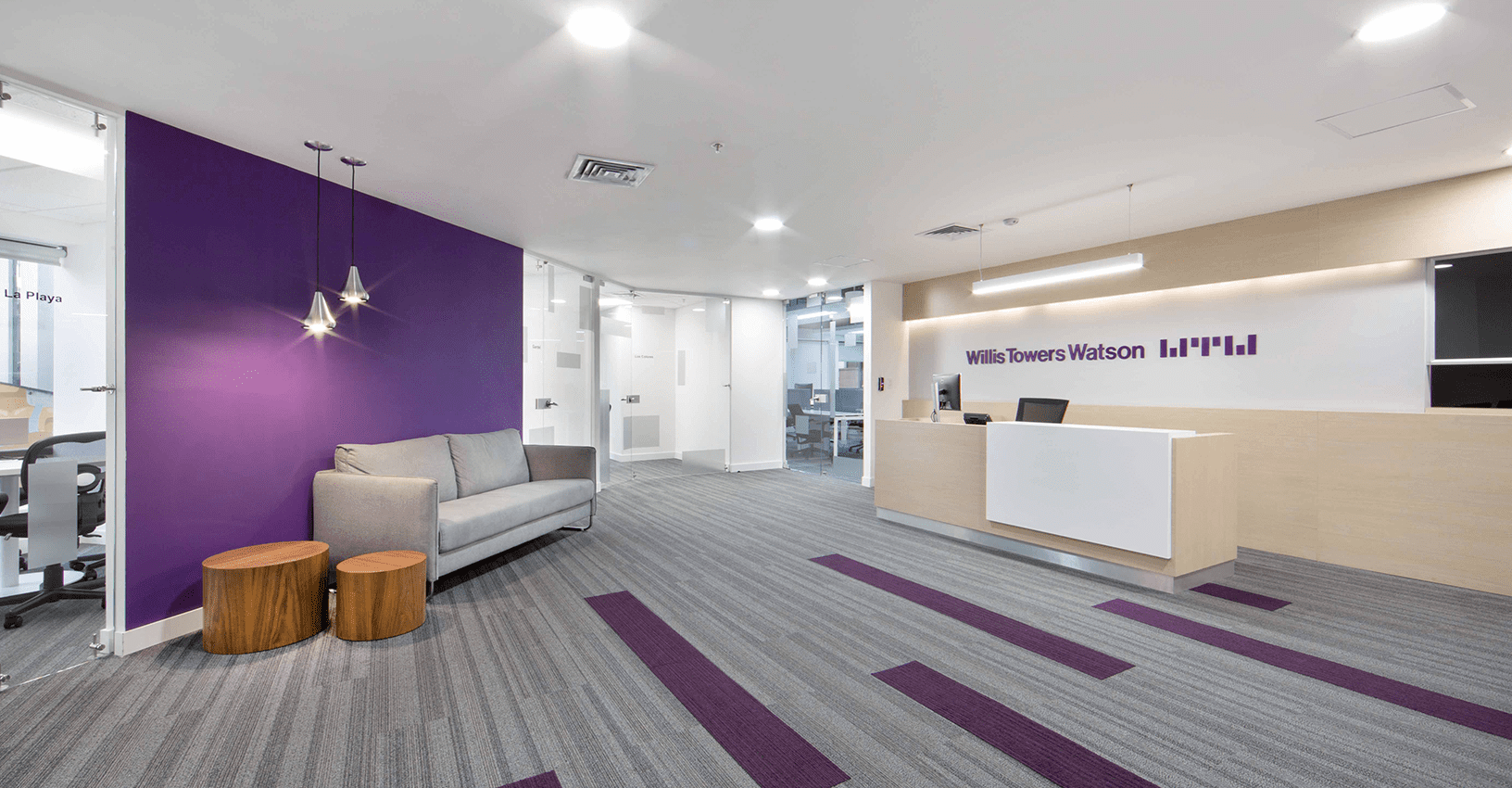
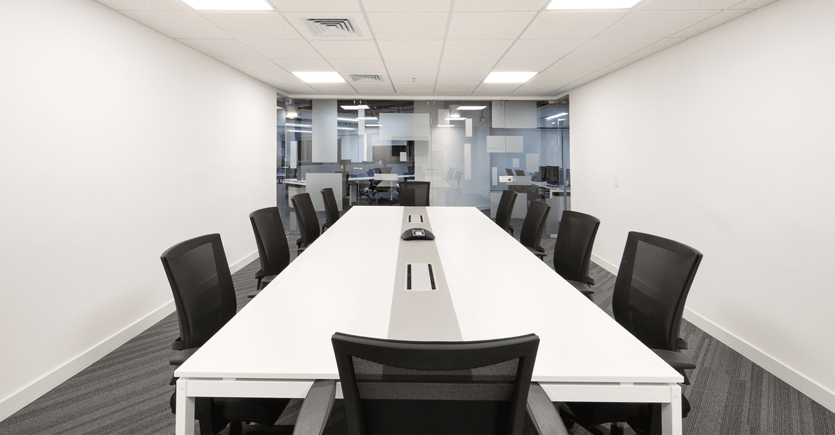
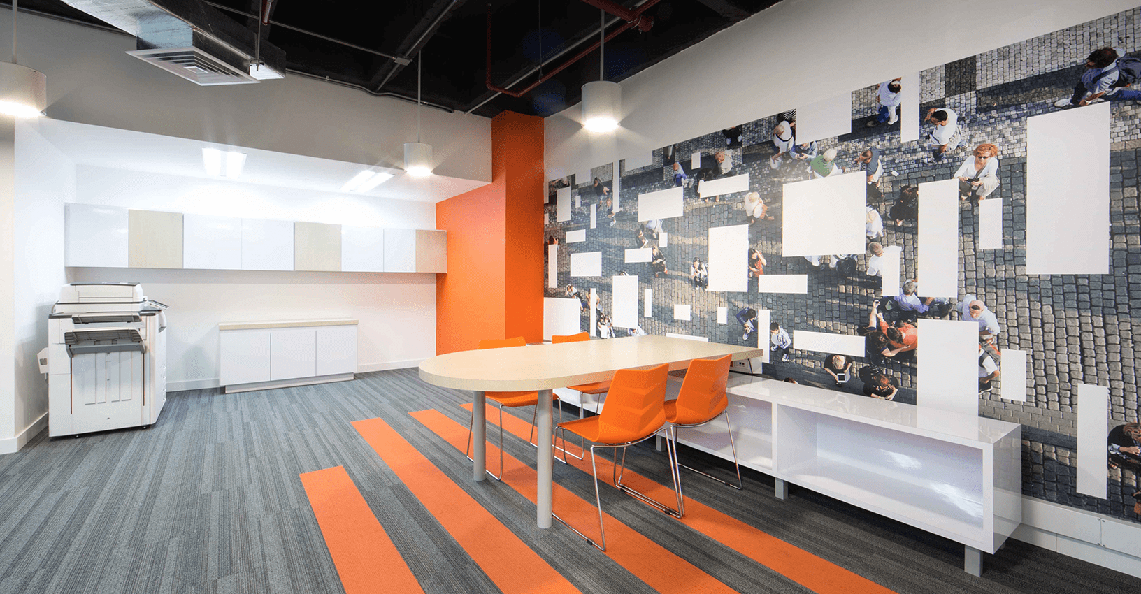
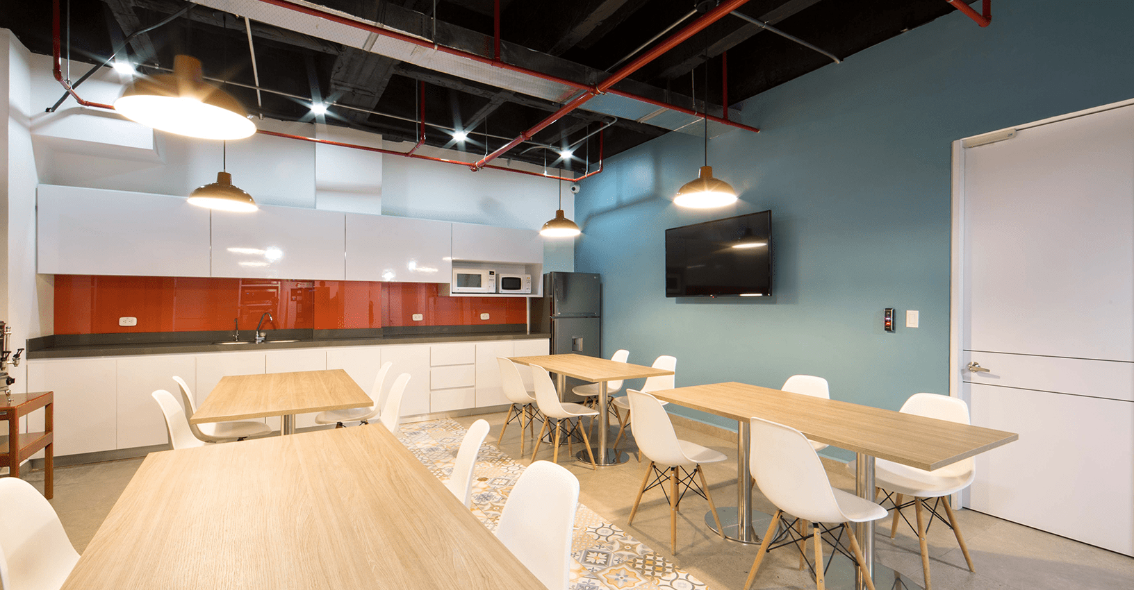
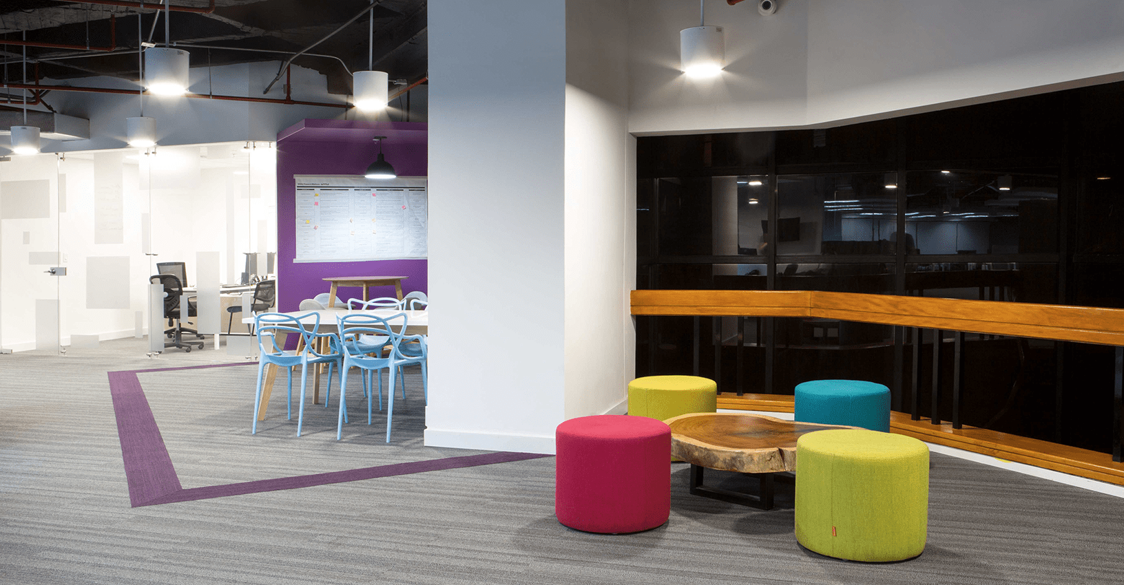
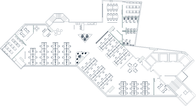
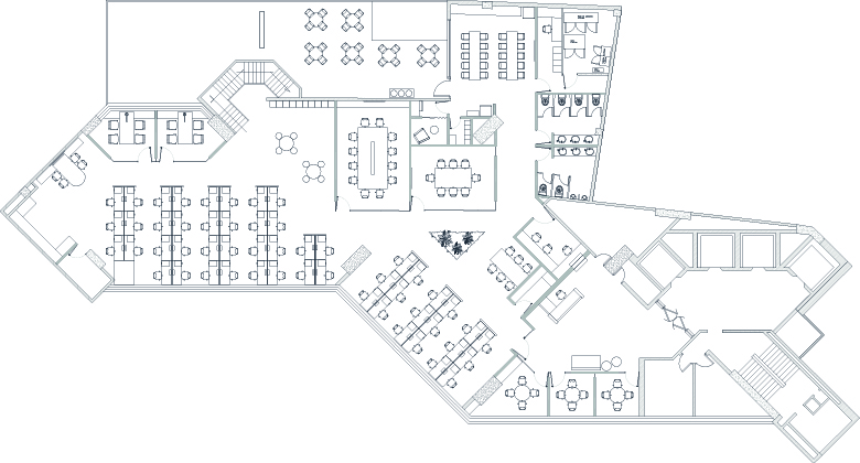
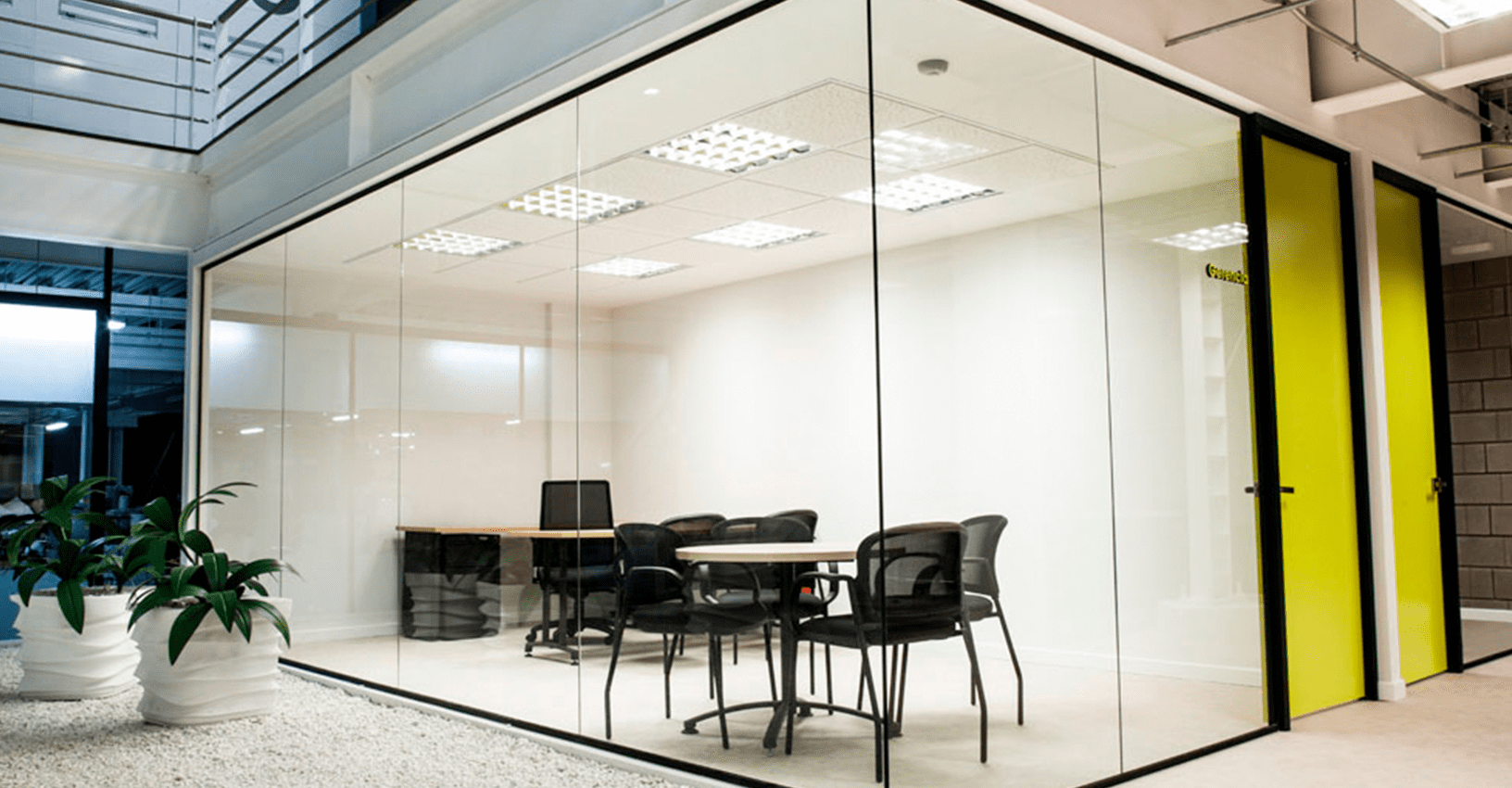
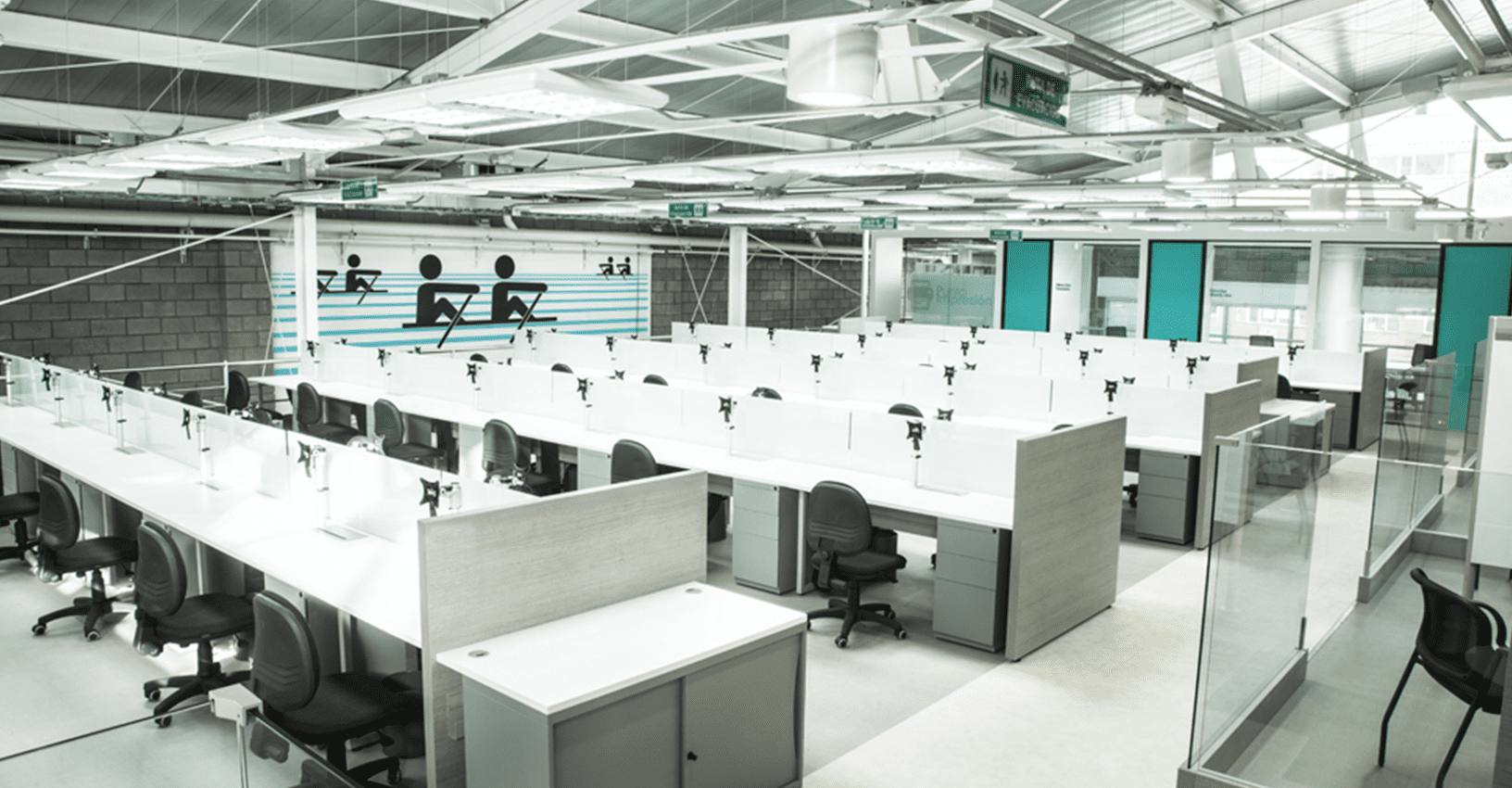
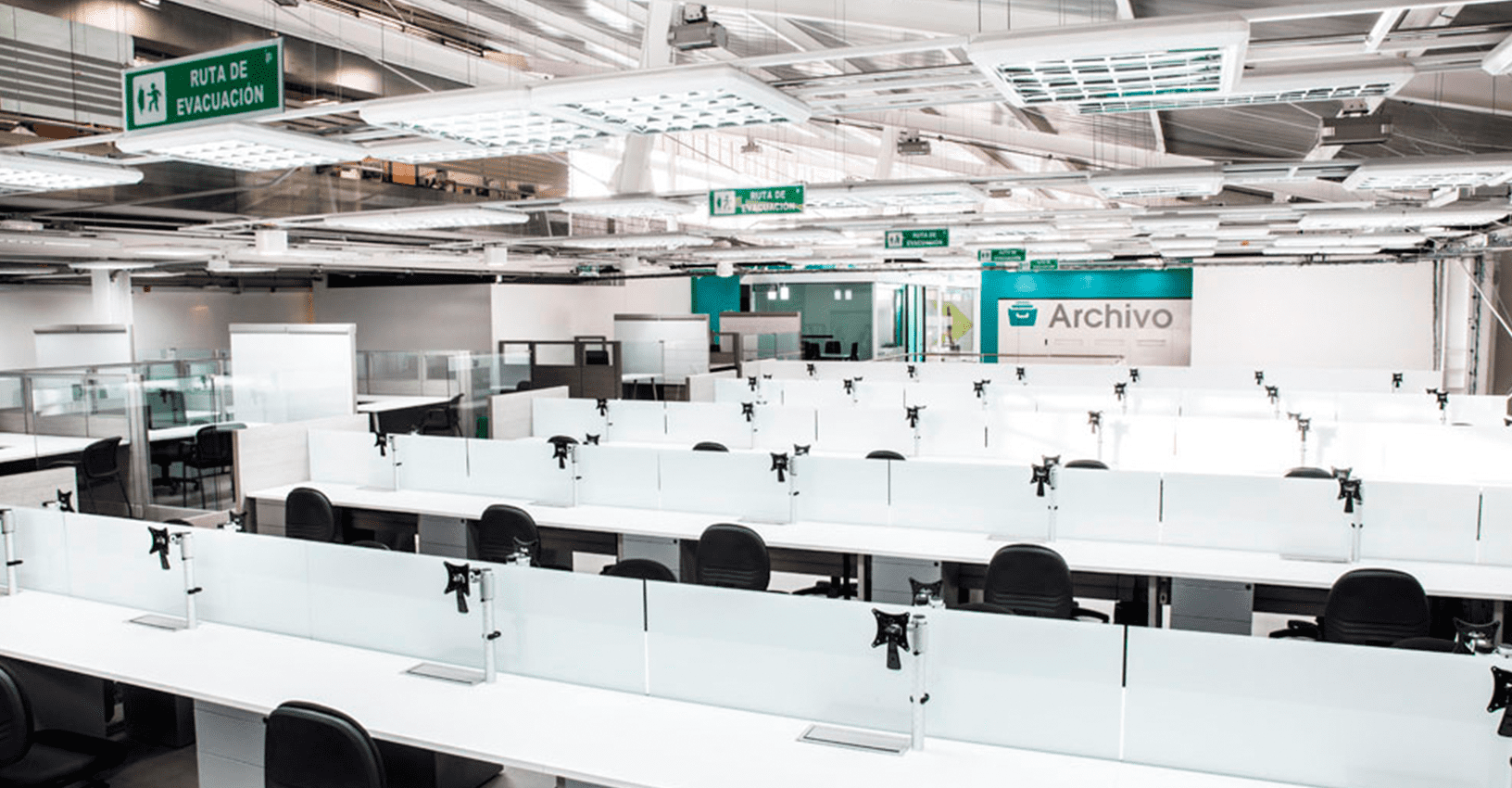
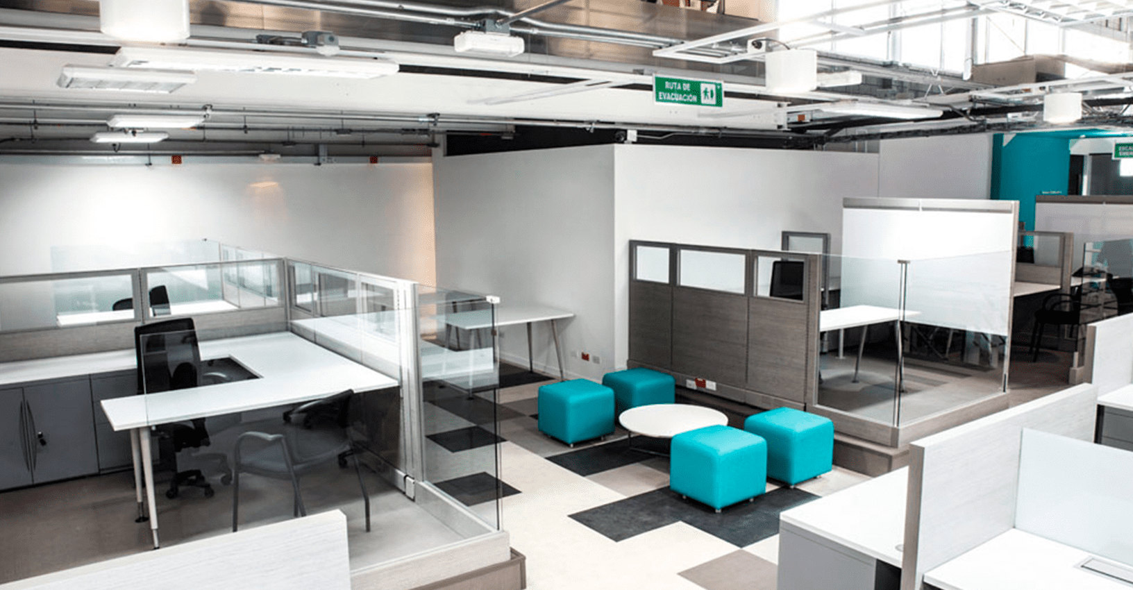
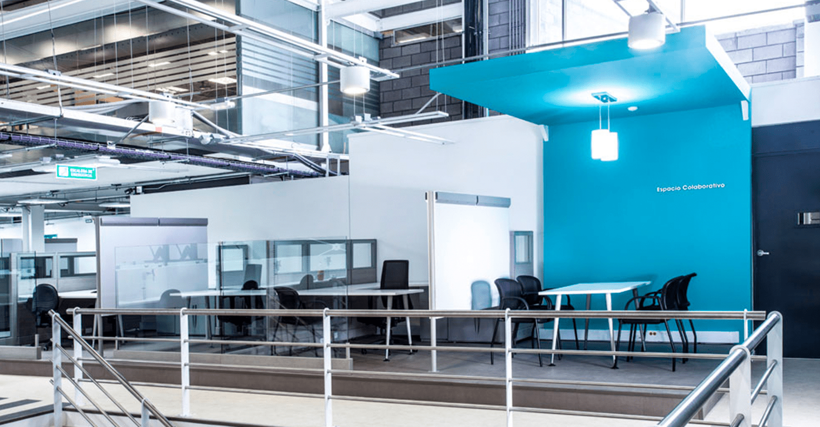
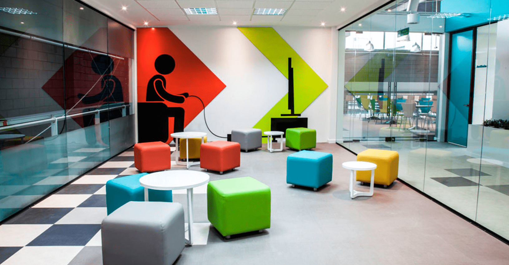
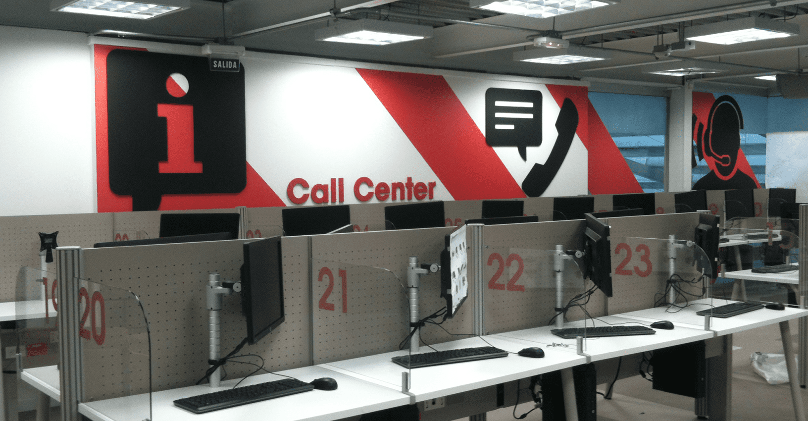
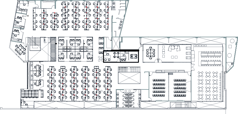
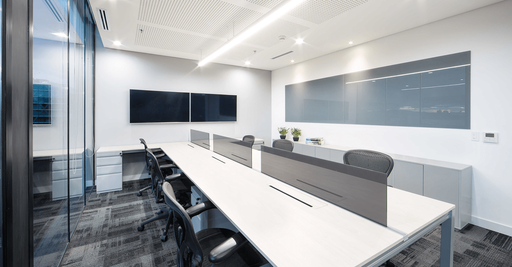
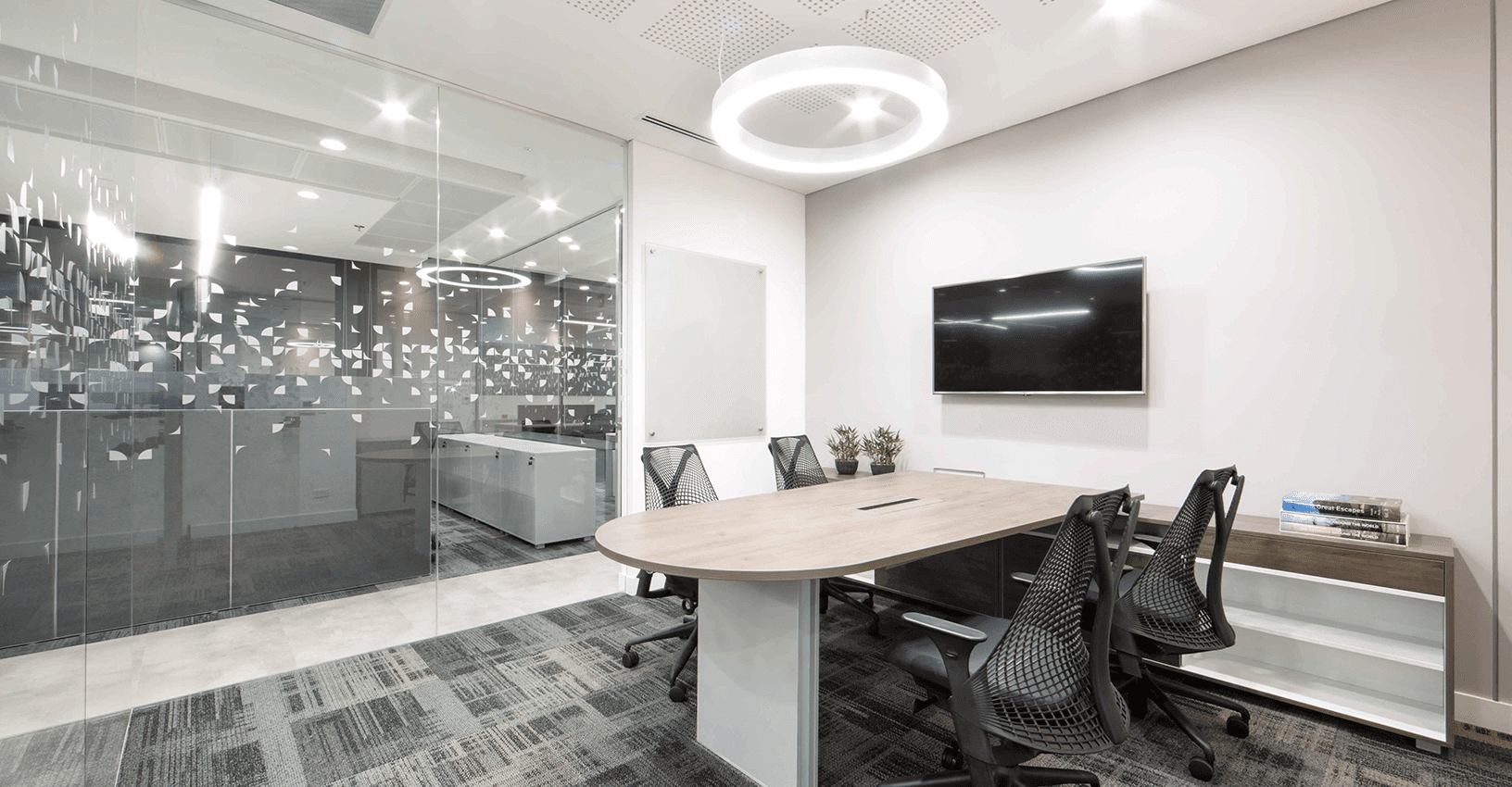
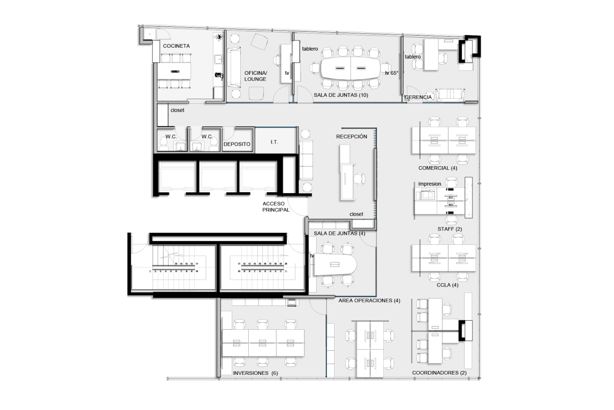
The aim of the project was to achieve efficiency in the same work space, totally transforming the spaces through the change of lighting, furniture and general atmosphere optimizing resources.
Introduction
Preserving the industrial character of the facilities, and providing more and better work spaces, were the main redesign concepts for the Liberty insurance claims center. Through the use of bright colors in the graphic elements, combined with industrial finishes in ceilings and floors, it was possible to give an industrial but pleasant sense to the space. From a functional point of view, the redistribution of spaces and the inclusion of more areas for meetings, collaboration and training, turned the use of the headquarters upside down, significantly improving employee satisfaction and the perception of visitors to the headquarters.
Clients
Date
2005
Categories
Tags
Introduction
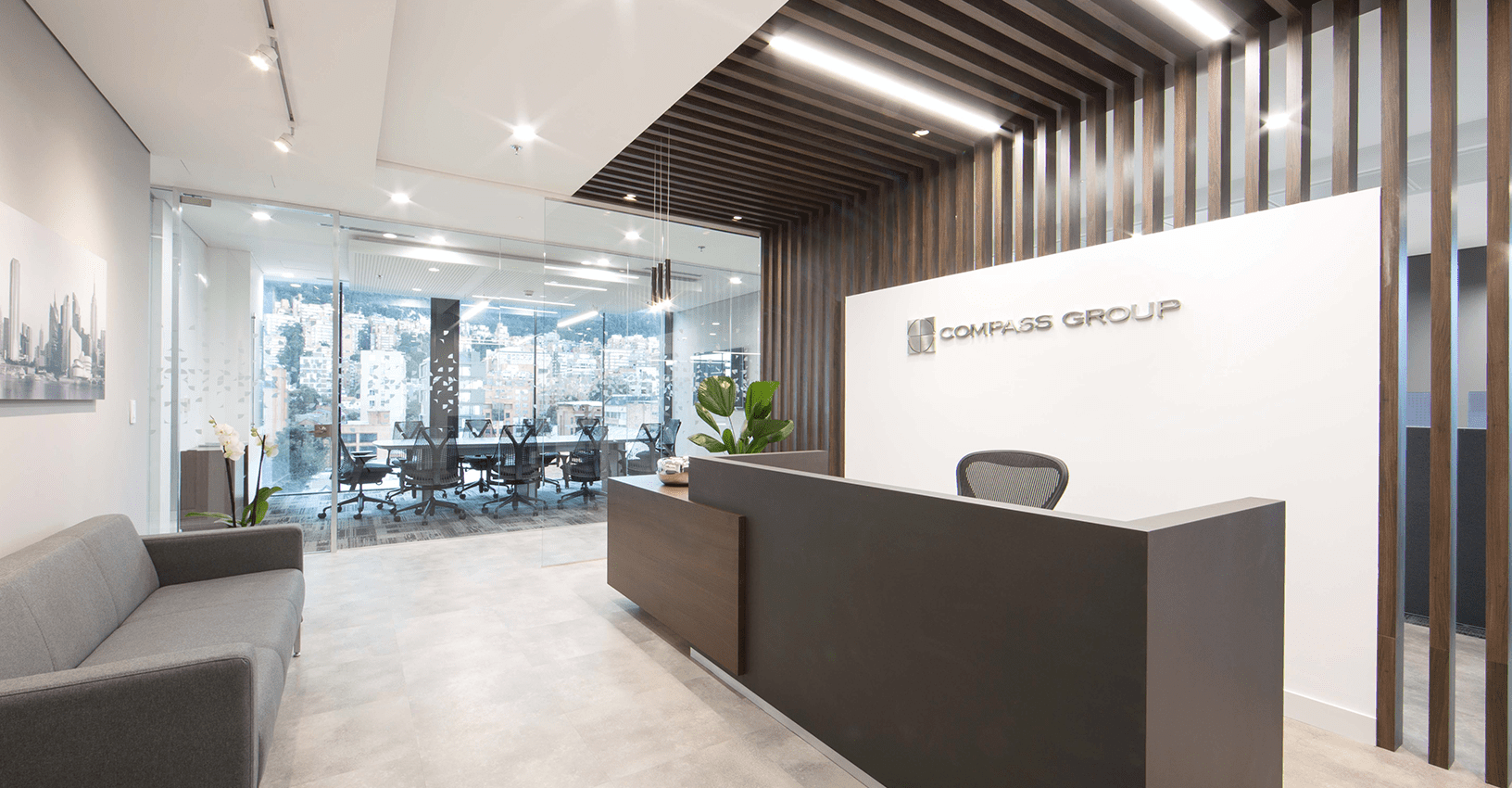
Located in one of the residential and corporate urban renewal areas, with high business development, CompassGroup, a Chilean company that specializes in investments in Latin America, decided to take half a floor in a new building to adapt its corporate offices and for customer service.
The new design takes into account, not only the functionality of the positions, including more meeting and collaboration areas, but the innovative impulse of the brand and its strength. The use of neutral colors with color accents in focal points allusive to the brand, allowed to give the space a renewed and avant-garde air.
The natural light and large perimetral windows of the office were the perfect complement for the interior design of the investment firm in this new space.
Clients
Date
2018
Categories
Tags
Introduction
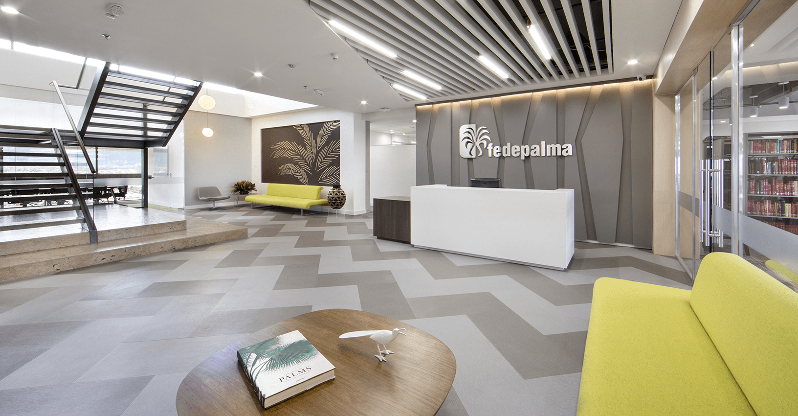
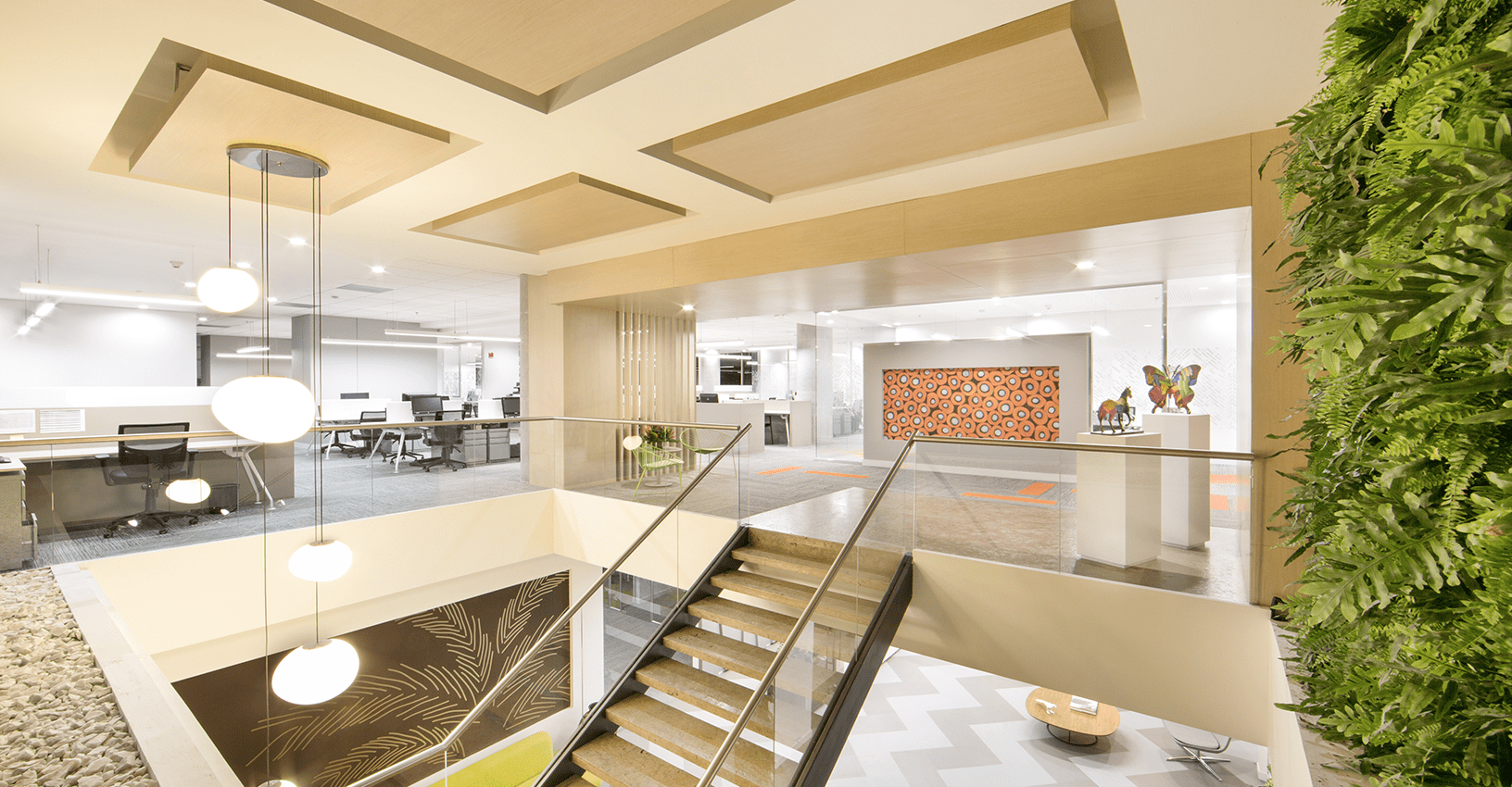
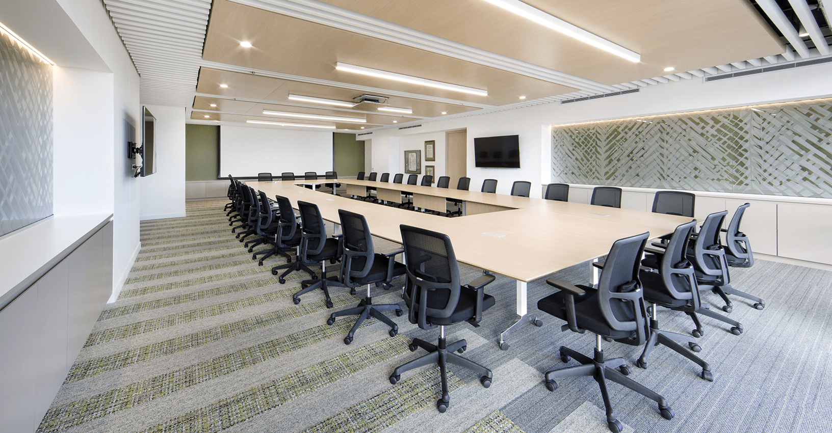
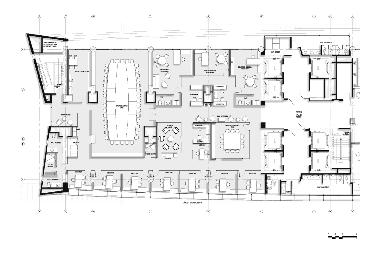
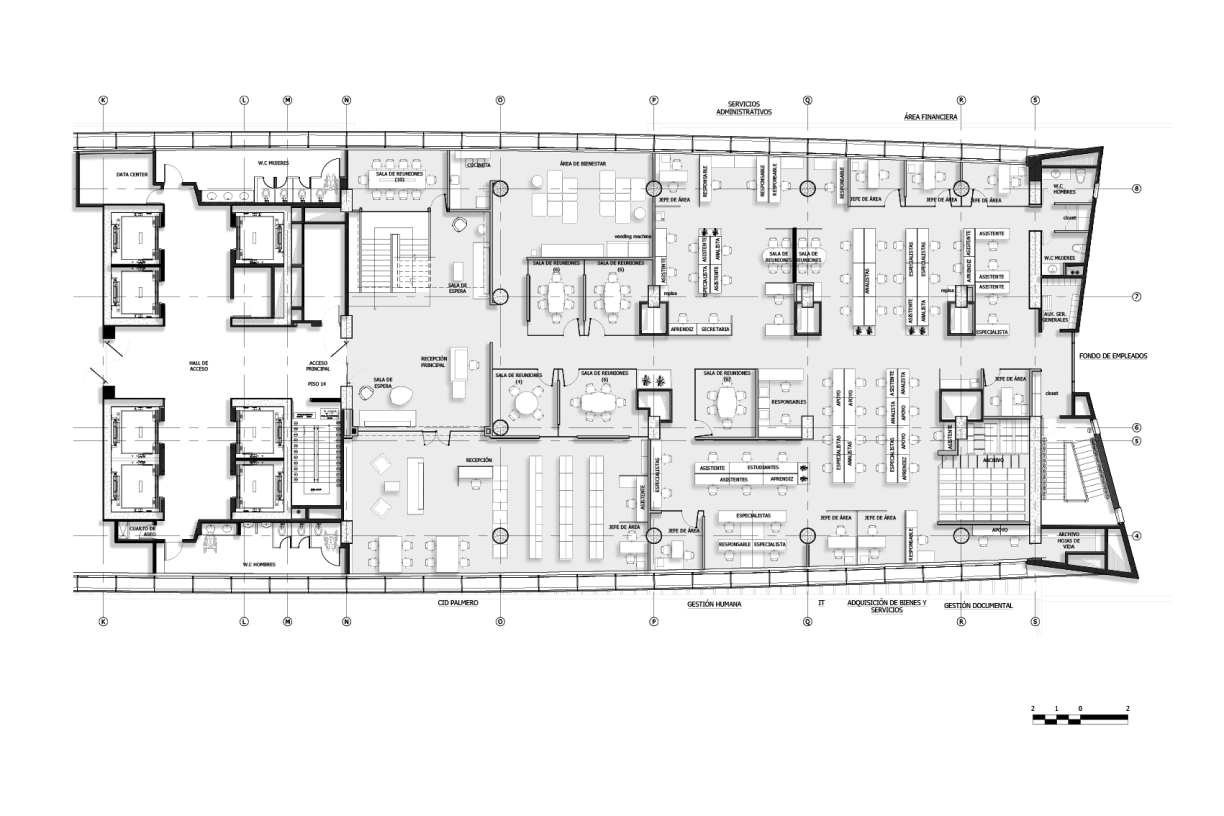
After winning a bid in which 18 bidders participated, the challenge of this project, the new headquarters of the Colombian Palm Tree growers Federation (Fedepalma), was unifying two headquarters of the company: the management area and the operational area, integrating more than 300 employees under the same space.
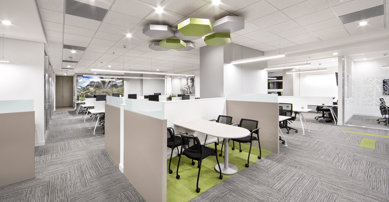
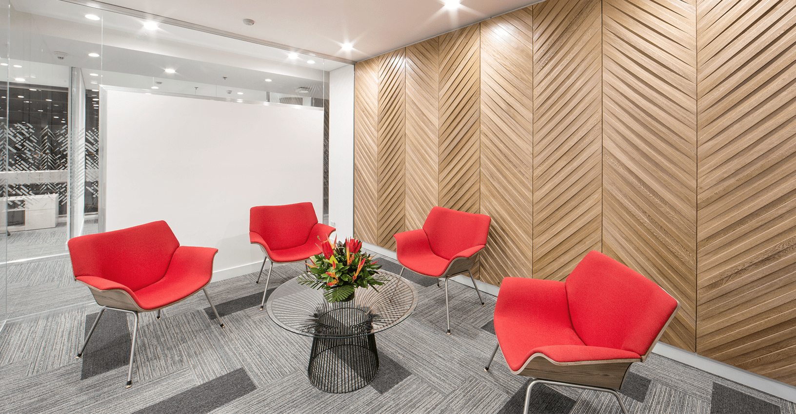
The breakdown of the palm tree leaf and its fruit, was the starting point to develop the design concept; the selection of the color palette and richness of textures applied to the space came from it as well. A living green wall in the double-height staircase space is the main actor of the reception and the perfect doorway to enter the facilities. Seeking to optimize the operation, encourage teamwork and achieve general welfare, an open plan distribution was created, with executive offices in a private area, different collaborative spaces, leisure and wellness areas, and formal meeting rooms for clients and visitors.
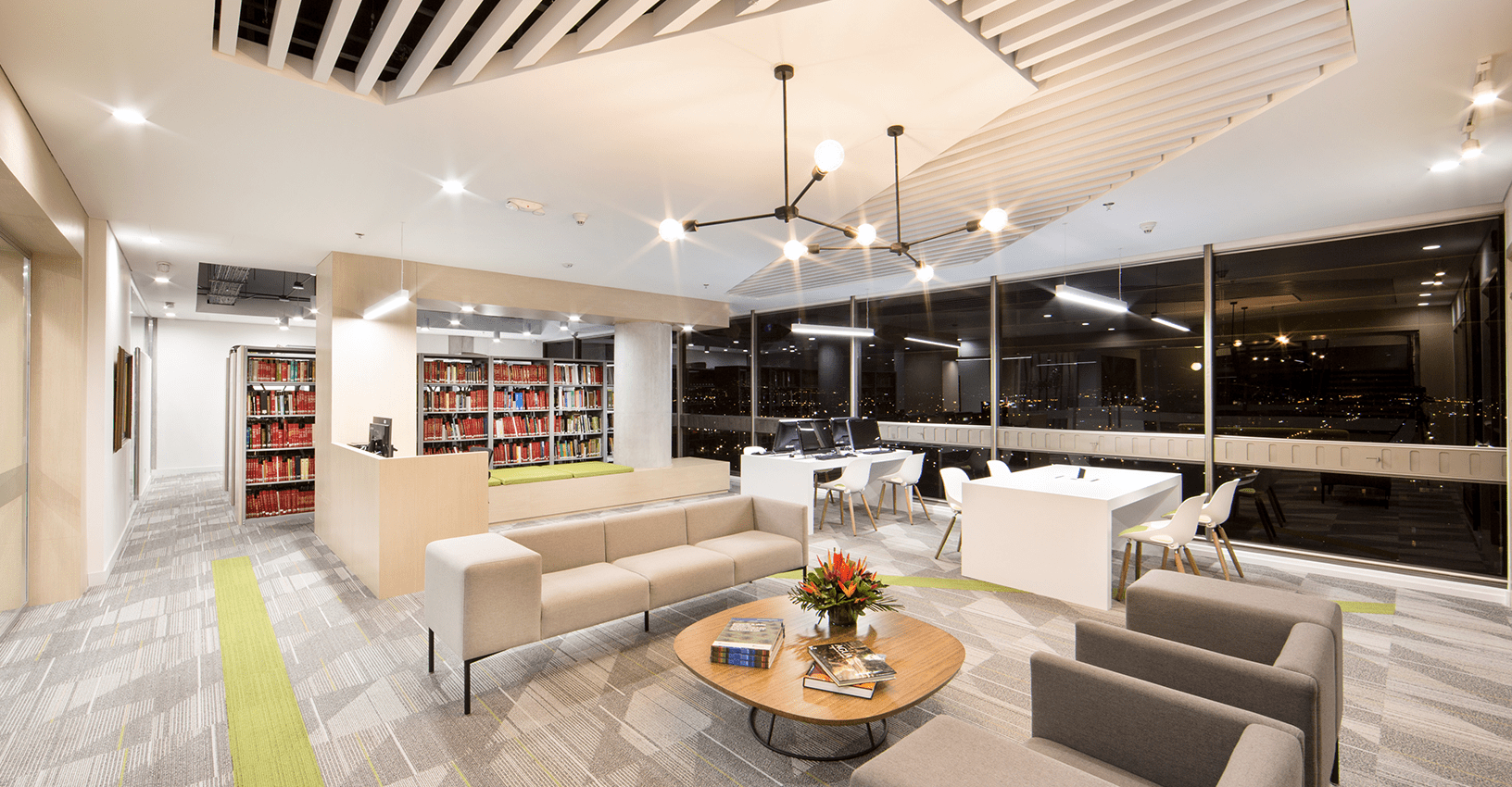
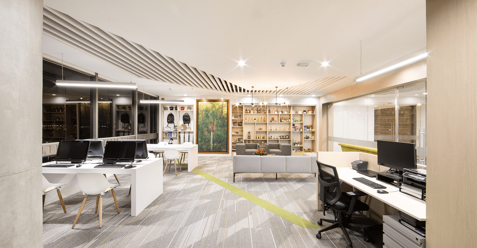
A consultation and research area were also designed to be used by people from the guild, with a wide selection of publications and educational material, as well as technological research tools.
Clients
Date
2018
Categories
Tags
Introduction
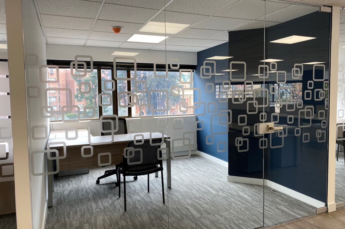
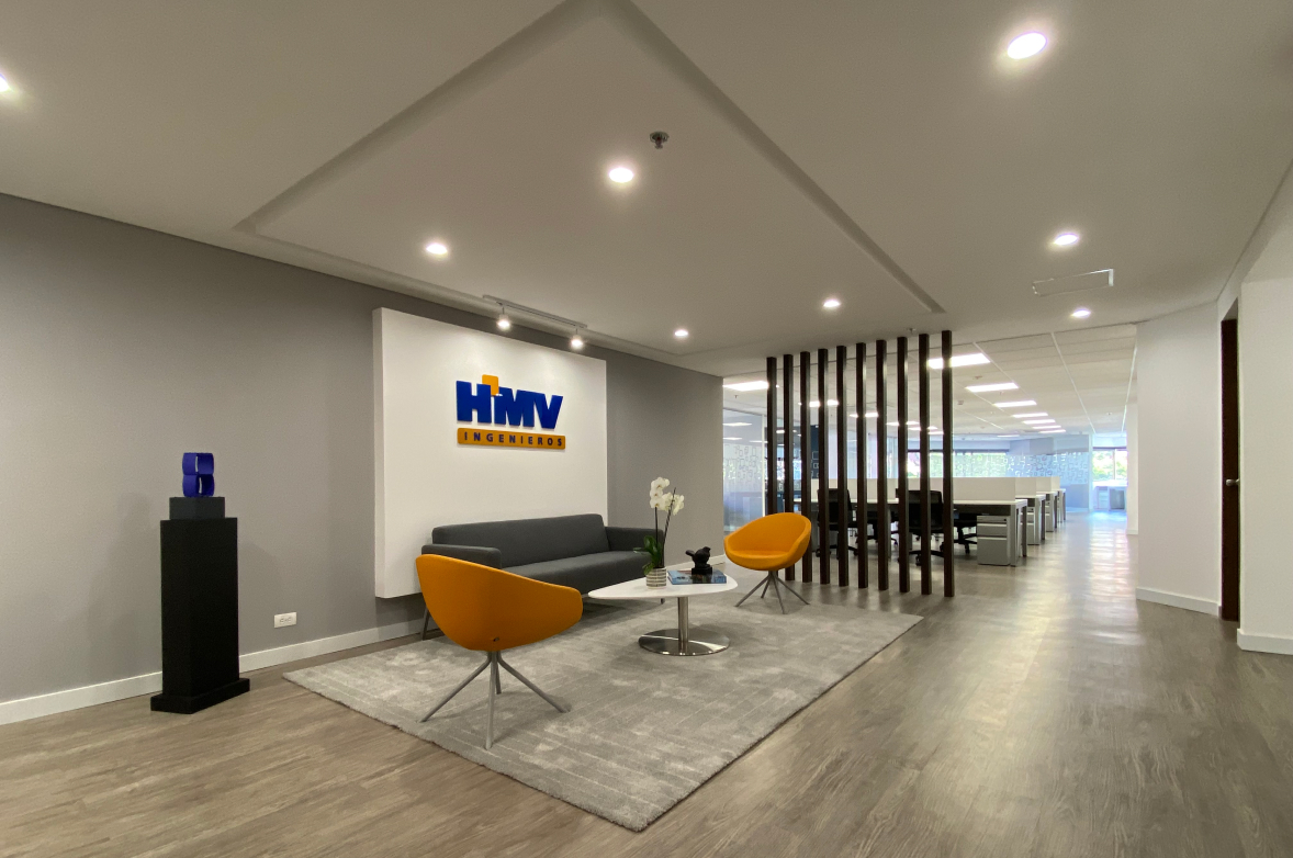
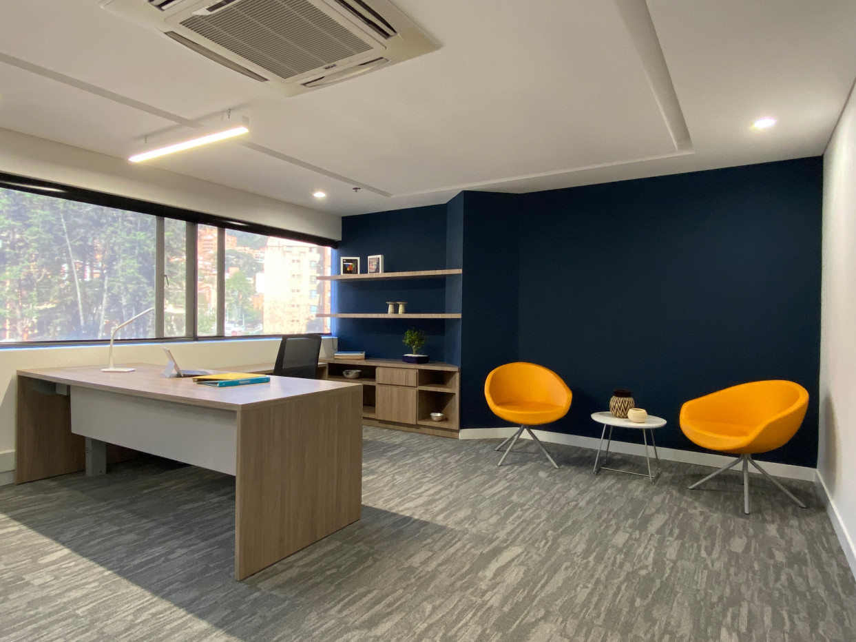
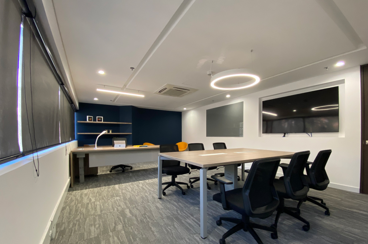
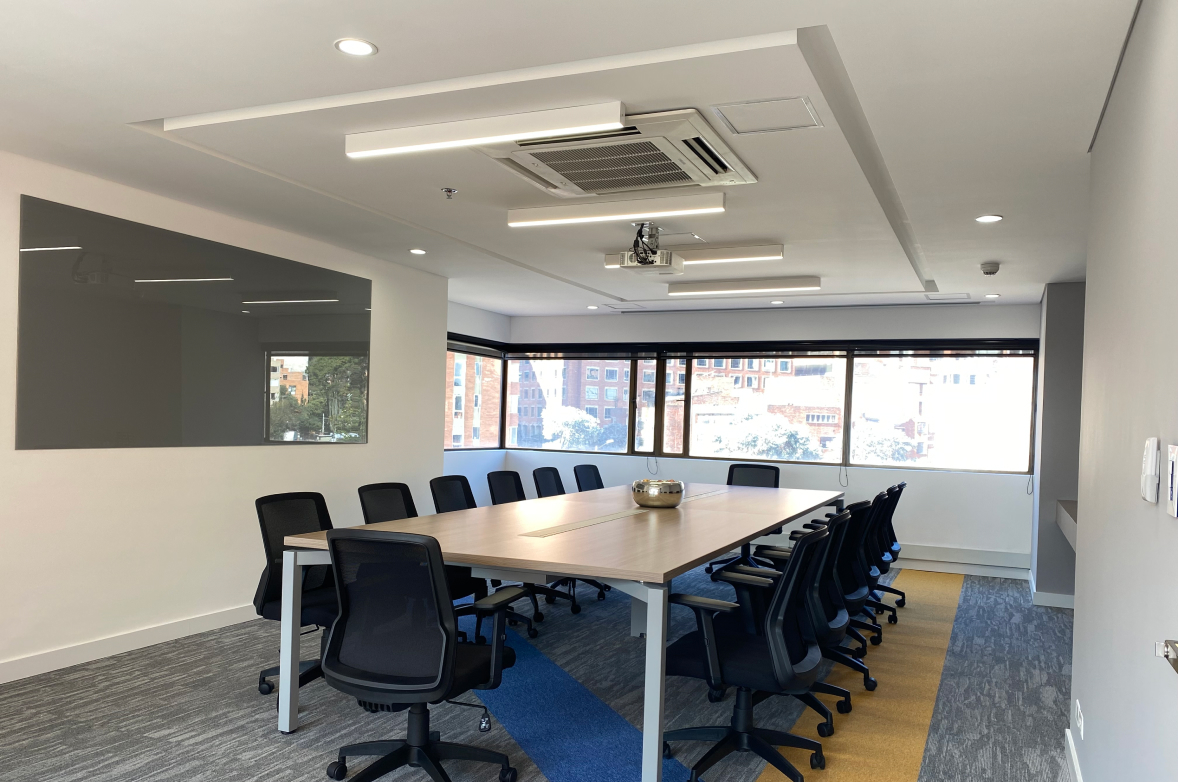
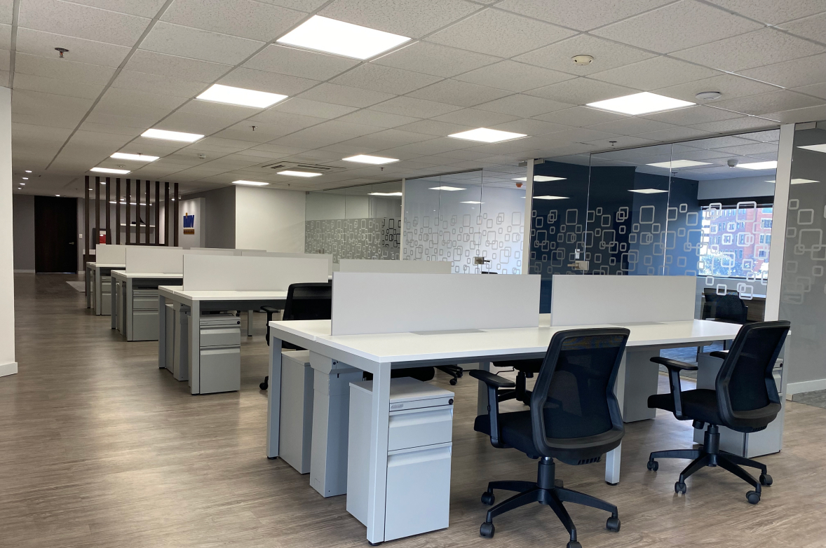
After the arrival of a new CEO, to this Engineering and Technology company, with more than 60 years of experience in the American continent, the aim was to reinforce the company’s Value Promise, improving the quality of life of its collaborators, through changes in the physical infrastructure of its corporate spaces.
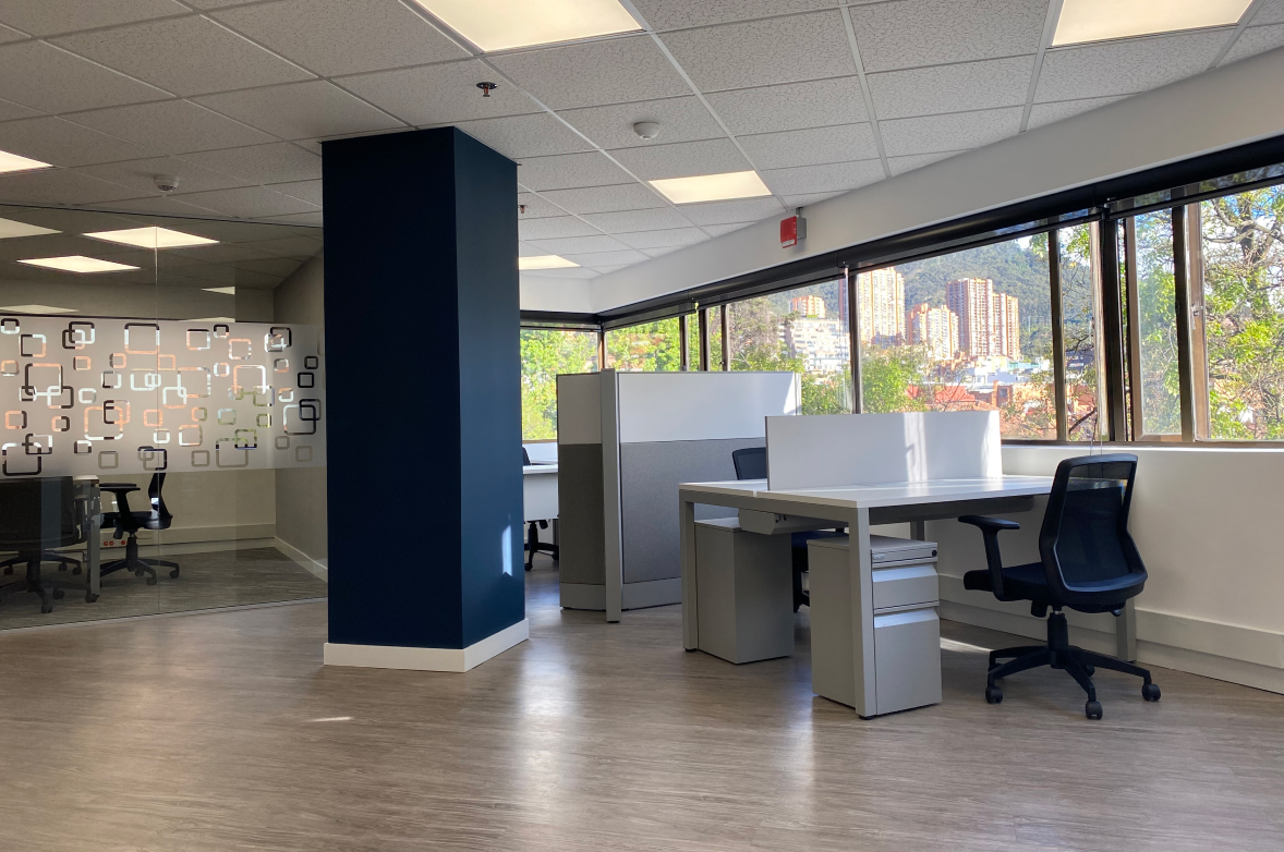
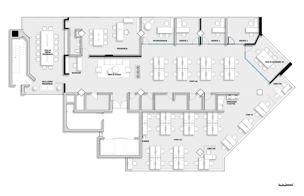
With a basic budget, positive changes were made seeking to improve working conditions: generating visual amplitude, allowing natural light to enter to the entire office, expanding the capacity in number of operating positions, standardizing work typologies according to hierarchical positions, and generating a more comfortable and spacious environment in the main meeting room.
A neutral color palette was used on floors and furniture, in contrast to accents of blue and yellow corresponding to the brand guidelines.
Clients
Date
2021
Categories
Tags
Introduction
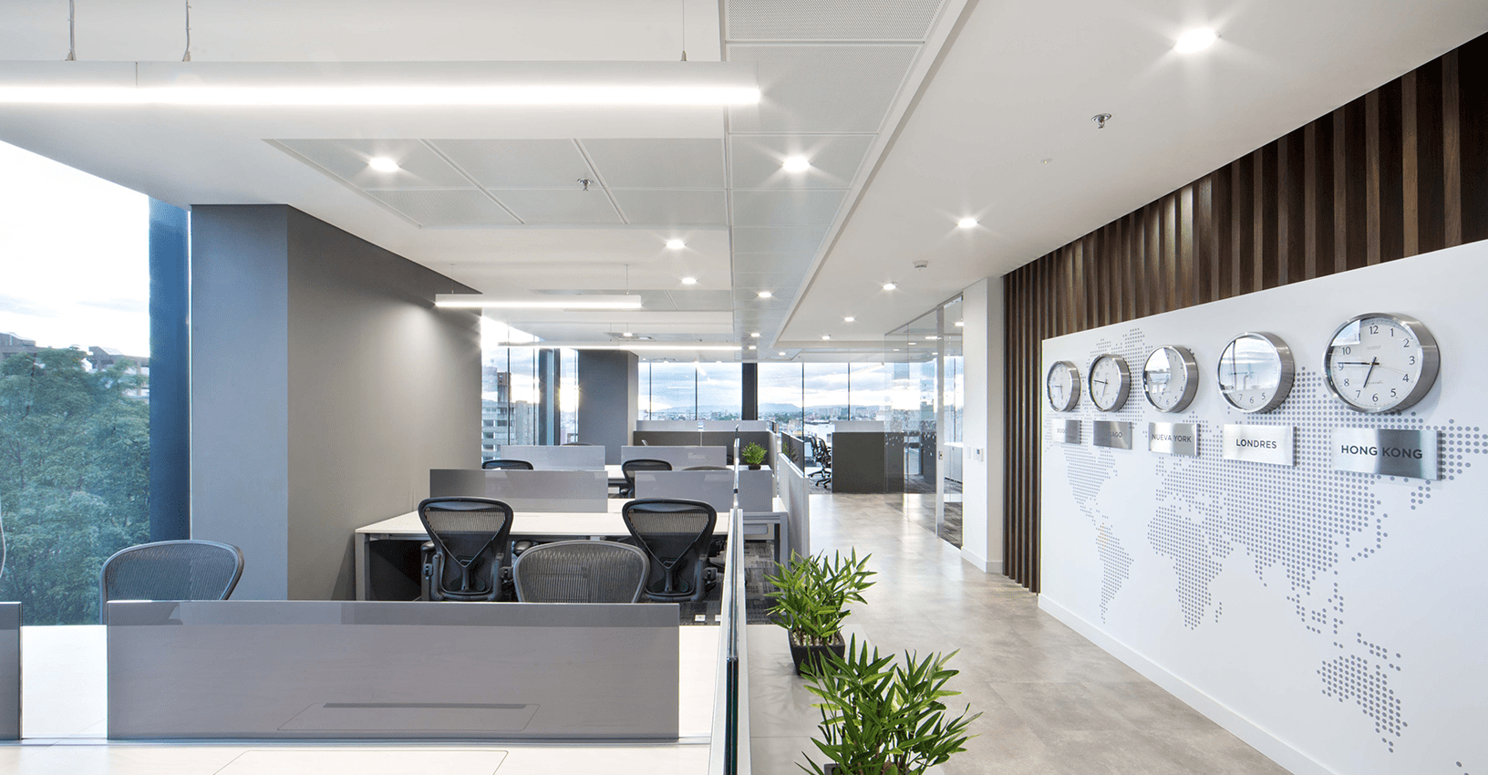
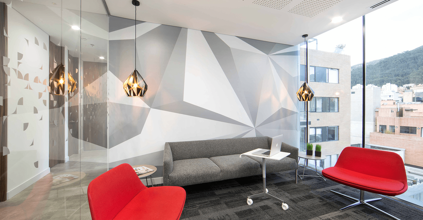
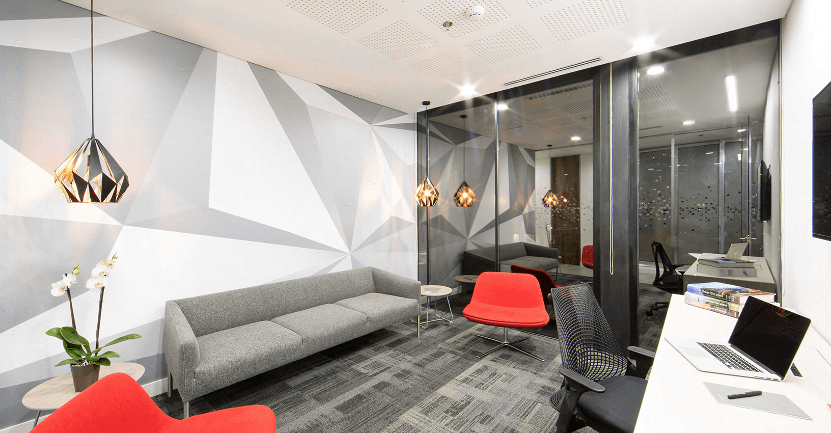
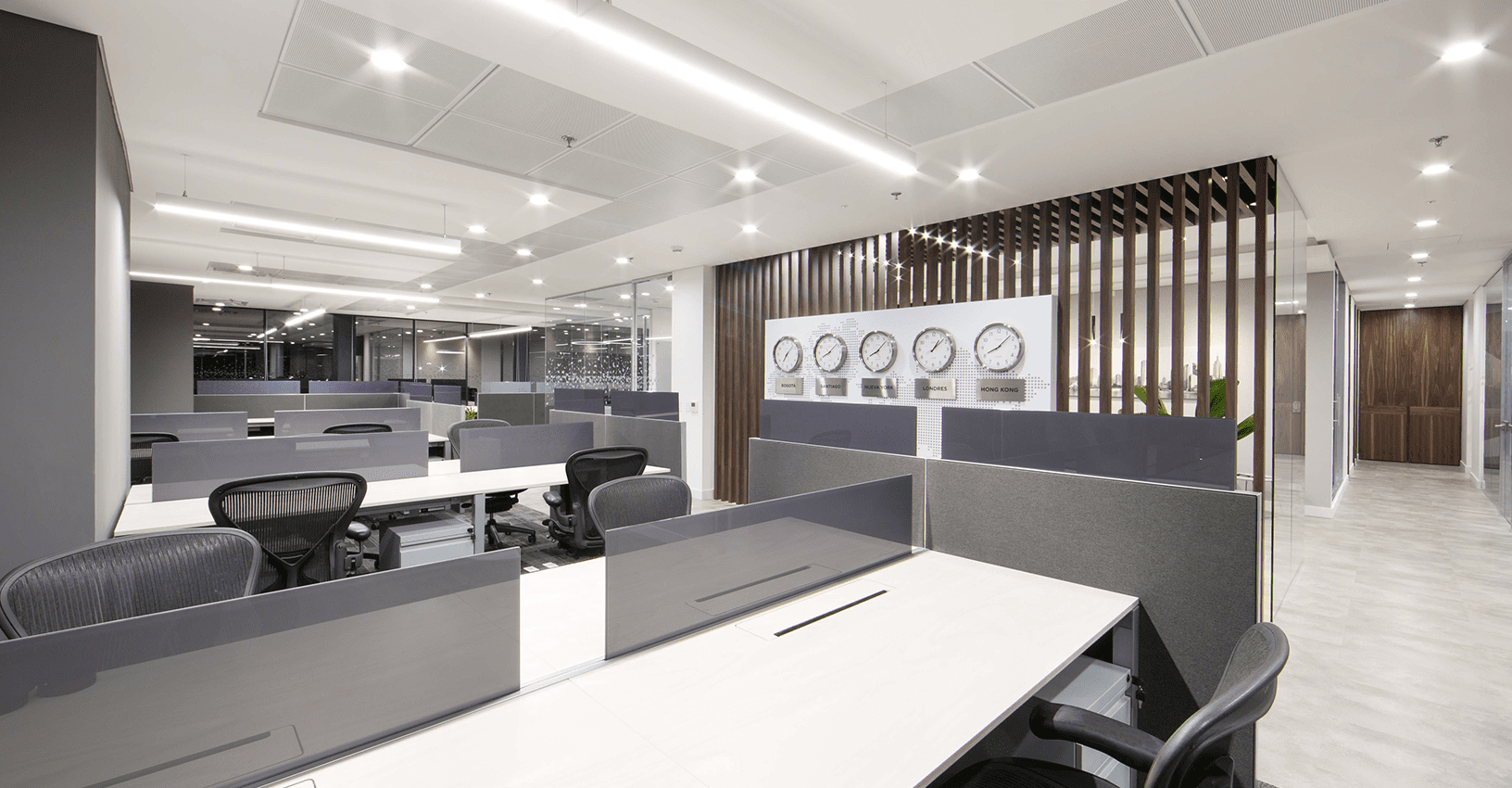
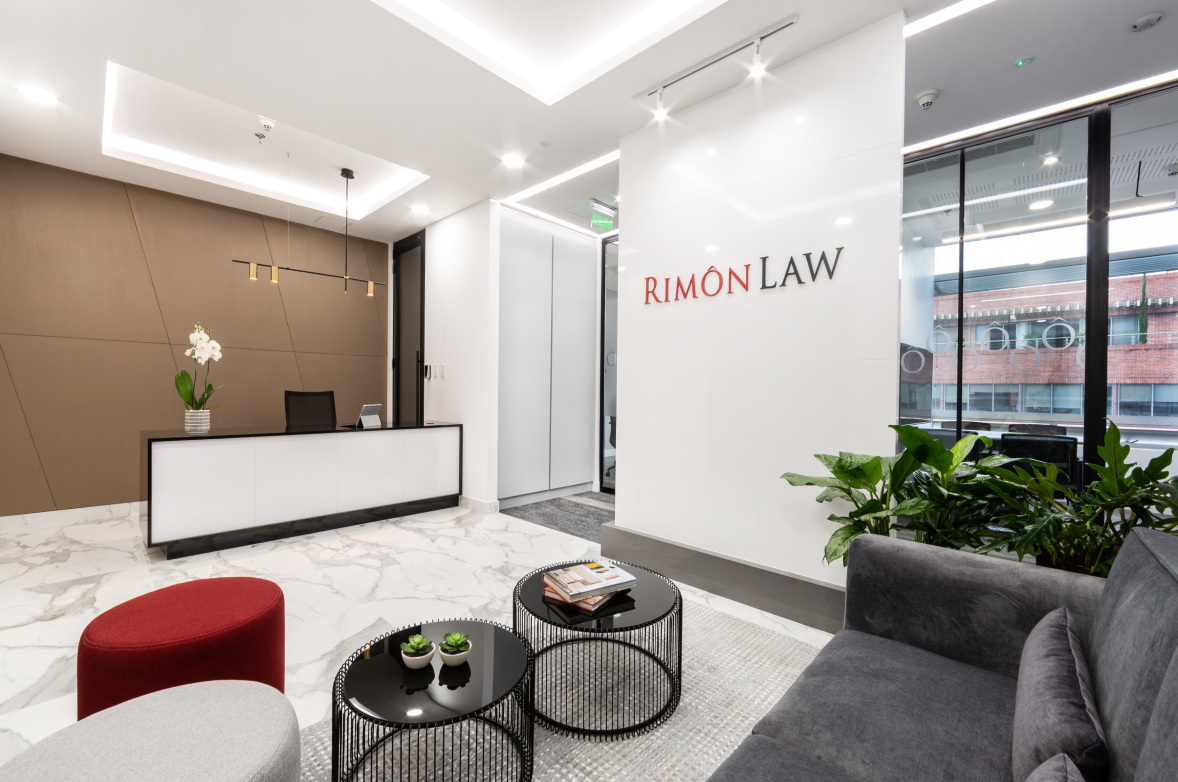
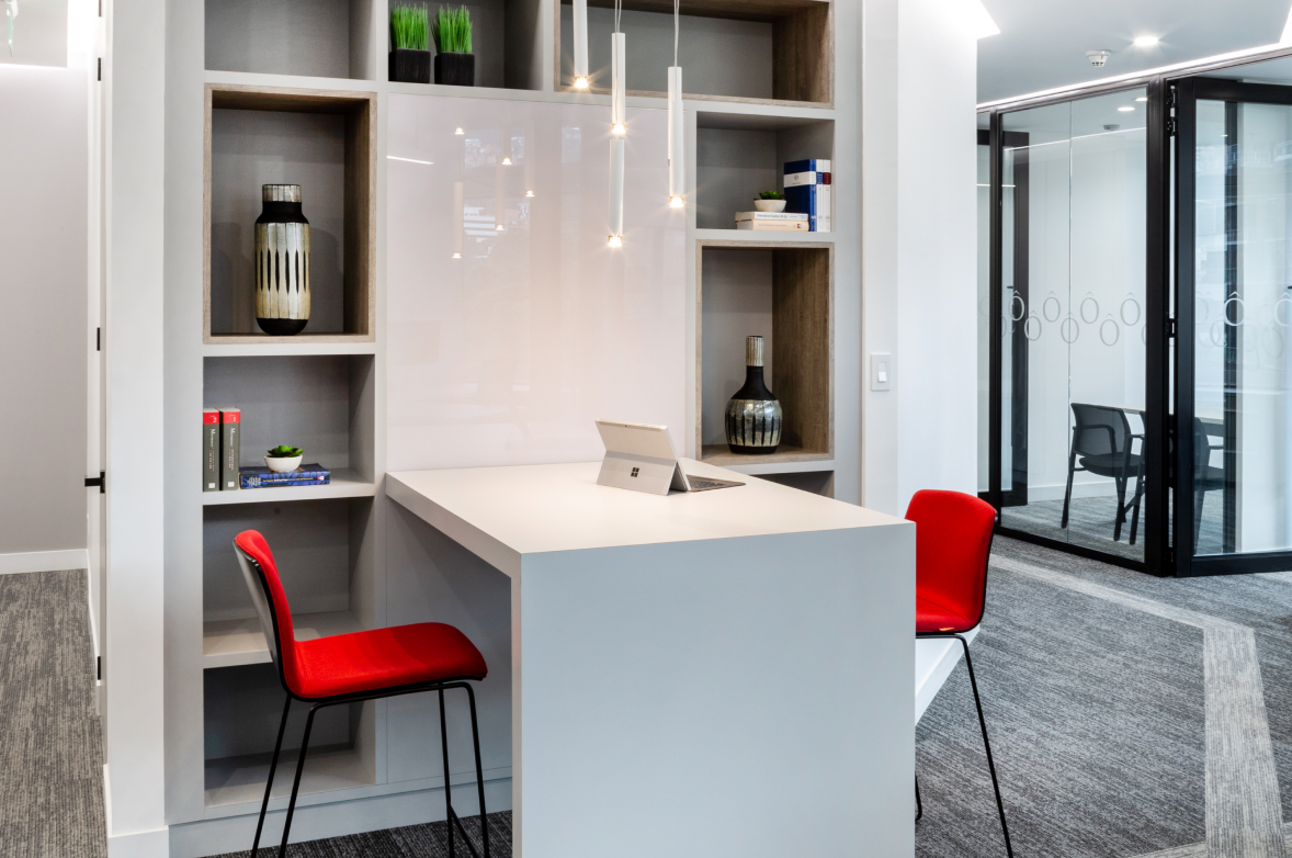
This international law firm, with presence in 14 countries, and more than 45 offices worldwide, opened its first regional office in the city of Bogotá, with the purpose of creating a modern and sophisticated corporate space that reflects not only the attributes of the brand, but transmit strength and projection to its new clients.
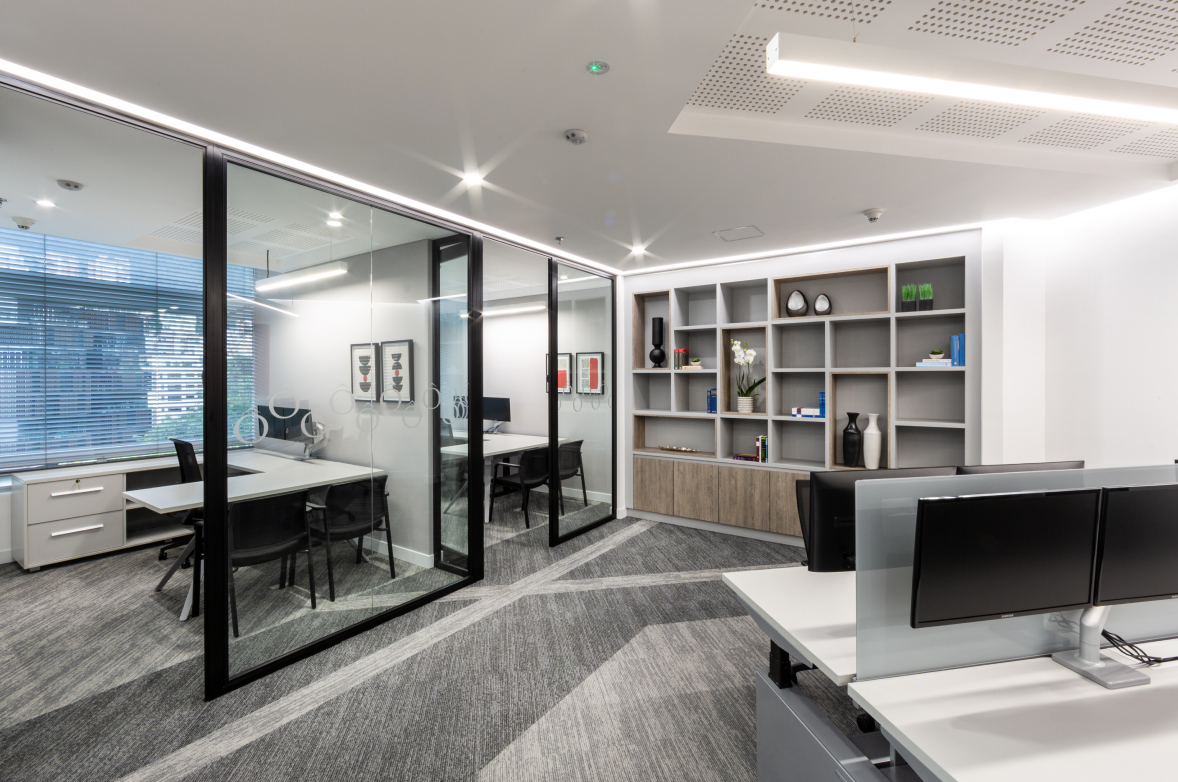
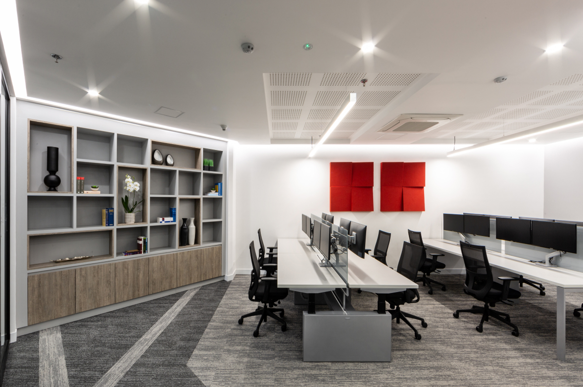
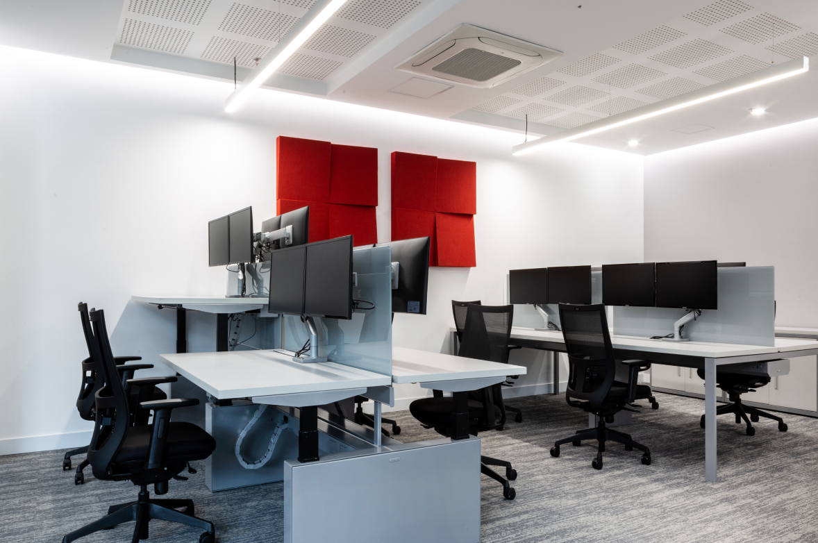
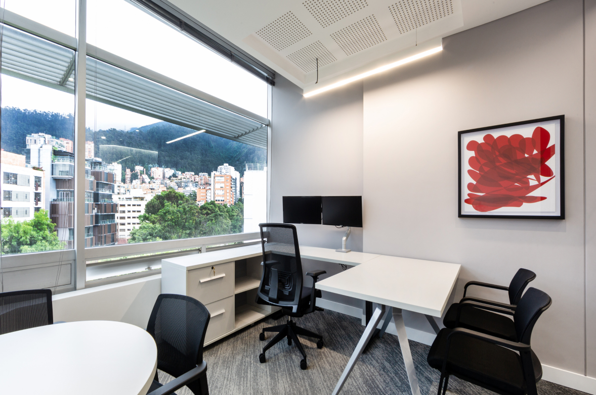
Through the use of neutral colors applied to architectural elements, combined with red accents in textiles, acoustic panels, and decorative accessories, including natural plants, the space was meant to feel fresh, natural and welcoming.
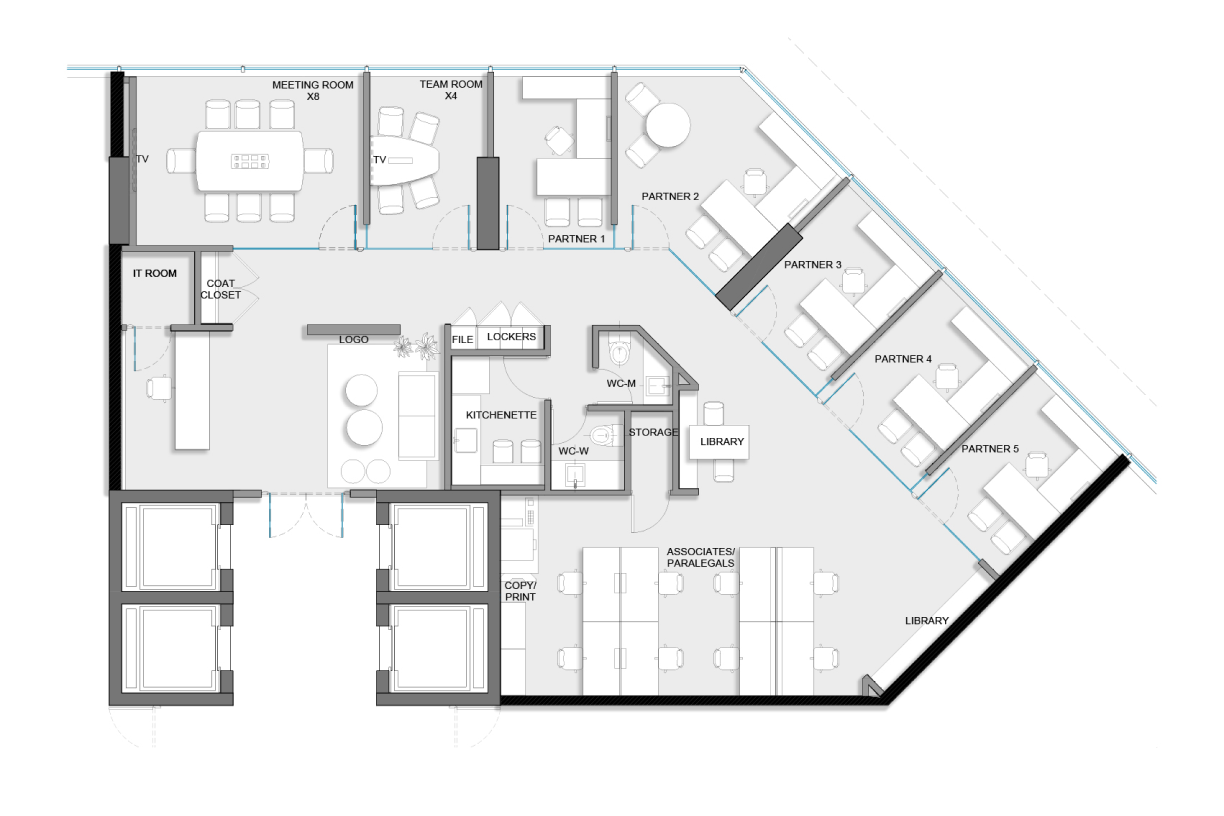
As for the distribution, the client area was located near the entrance, differentiated from the operative area, leaving the partners’ offices on the perimeter of the façade, with acoustic floor-ceiling glass divisions, allowing natural light to enter the interior of the space at the operational area, allowing great city views and transparency from any interior angle of the office.
Clients
Date
2021
Categories
Tags
Pagination
- Previous page
- Page 4
